fantastic beasts 3:
the secrets of dumbledore
Paid Media Banners
creative explorations
Fantastic Beasts, a film series that is a spin-off of the Harry Potter franchise, has a rich, robust, and magical world-building that we wanted to replicate into our paid media ads. Here I explored some creative solutions for how we could build a world within our banner ads that fans could recognize while still creating dedicated space for the HBOMAX branding to shine.
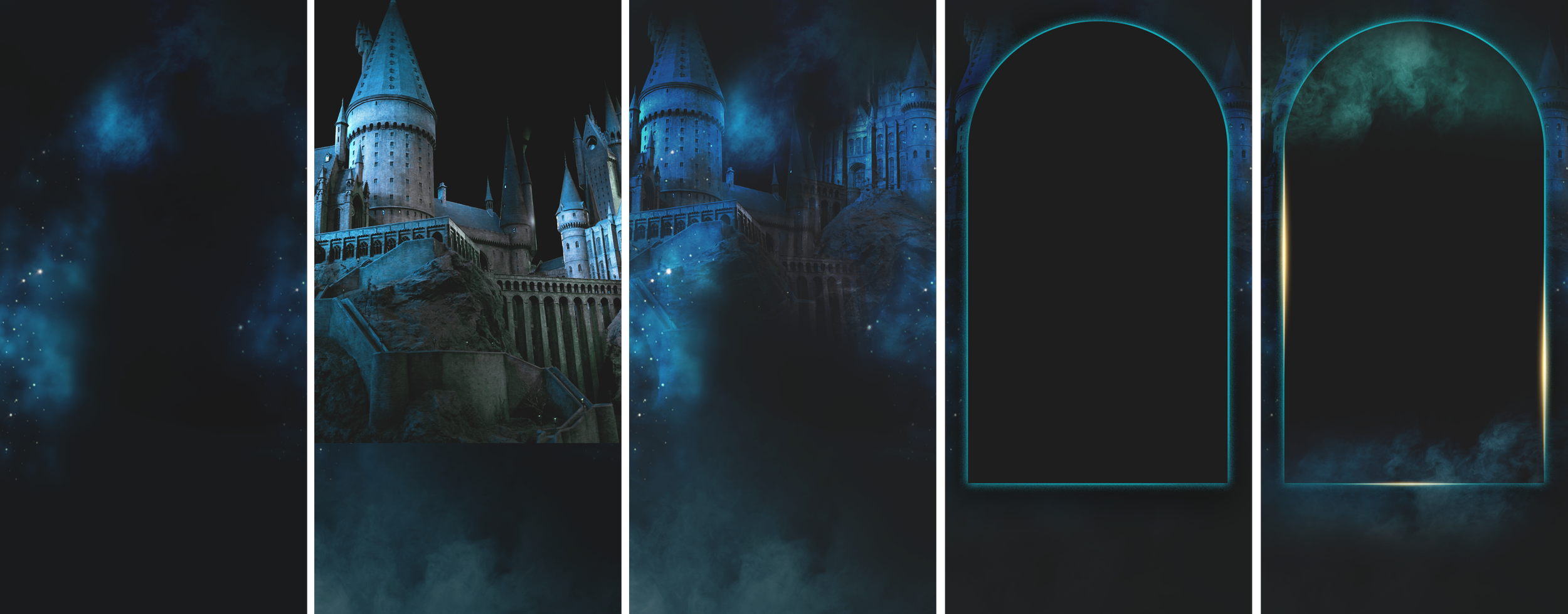
A photo of the real life Hogwarts Castle model used in the Harry Potter movies.
Taken at The Harry Potter Studio London Tour.
The Hogwarts Castle is iconic to both movie franchises and I thought it would be fun to use a photo I took when I went to the London studio tour. Although we did have access to photos of the in-movie castle, the raw photographs of the model had a different look and feel to it, with gritty textures you could really see as this was not processed in post for the big screen. The added textures gave the background more a more curious feel without it feeling like it was too much of the focus.
challenges + solutions
One of the biggest challenges in creating these paid media banners is with formatting legibility within a small amount of space for branding and legal lines. This creative was especially challenging as we needed to include the HBO logo, a shortened legal line, a ratings logo, and on top of the movie logo, we also had to add a “Wizarding World” logo as it directly correlates to the Fantastic Beasts franchise. WHEW. That’s a lot of logos! NOT TO MENTION, we also had to add in our own branding for the HBOMAX app, which required the logo + CTA + copy + headline copy….
Although these things may be a quick glance for the consumers, as a designer, knowing where to place all of these necessities is part of the biggest challenge. It must be legible, it must be clear, but not overwhelming.
The solution here was to utilize a mix of font sizing and opacity to not overwhelm the overall design with too much text. This is where containers really shine. Having the arch design contain the art + logo + legal lines gives the ad some breathing space and separation between the HBOMAX branding below. I added some atmosphere and cloud textures behind the legal logos as well, as a way to alleviate the blank space and to further create separation between the movie art and the app branding.


